Have you ever met someone and just… clicked? That’s how I felt walking into Natalie Peters’ Washington DC studio, known as District Color Studio.
Natalie and I had followed each other on social media for years at this point, and it felt like I’d known her long before I ever met her face-to-face; however, it can be intimidating to meet someone after having known them through a social media lens for so long. Although I had connected with Natalie for a Zoom call about a month or so earlier (I’ll get to that later), it’s never the same as meeting someone in person!
Thankfully, and unsurprisingly, Natalie was as much a joy in person as she is through her Instagram profile, and as we started talking— over a shared love for decaf cortados I happily picked up across the street and how beauty, fashion, and faith are all interwoven— I felt like I was reconnecting with an old friend!
Natalie has been a certified True Color International color analyst since 2021, and seeing how she wore her True Autumn colors so beautifully throughout her wardrobe and her home, I was excited, albeit nervous, to receive my own color analysis. I was fairly confident that I would be an Autumn of some sort— I think my entire life would have flashed before my eyes if I were a cool-toned season. That just didn’t make sense to me! But I wanted to fully trust the process and understand how I could better accentuate my features instead of muting, dulling, or detracting from them. I don’t think anyone would disagree with wanting to put their best foot forward whenever possible!
As Natalie clad us both in neutral-neutral-grey capes for the analysis, we could start to see which shades were flattering and those that were succinctly not very quickly. Summer and Spring were out and Winter was soon following behind them. That left three shades in the Autumn palette— Soft, True, and Dark.
If, like me, you weren’t/aren’t familiar with the differences between the three types here, let me explain: There are 12 tones in the TCI color analysis method, which are differentiated based on three color dimensions: hue, value and chroma. Hue is the temperature, and what most people are familiar with— are you cool, warm, or neutral? Value refers to how light or dark (or in-between) the color needs to be. Chroma reflects how saturated the color is. Here, TCI ended up with 12 distinct colors: Bright, True, and Dark Winter; Light, True, and Bright Spring; Light, True, and Soft Summer; and Dark, True, and Soft Autumn.


Examples of the True Summer and Autumn palettes from the TCI Website.
Although we originally thought I was leaning neutral— which prompted more drapes in darker and more muted seasons— we draped me in a warm, brick red, and that was it! We both knew right away that it was the color to beat, and every subsequent drape from another tone felt like it couldn’t compare. While I did want to lean into the darker colors from the Dark Autumn palette, I couldn’t deny how washed out and harsh they made me look or looked on me, compared to the more vibrant colors in the True Autumn palette.
I am a True Autumn! 
So, now I know my colors… what do I do now? That takes us back to the beginning! Natalie and I first connected in a more formal way when she was looking for someone to help curate and establish a repository of beauty/makeup products for each season that she’d long been maintaining in her head and on paper. She is a true color enthusiast, and delights in the prospect of having a way to share these products with all of the different seasons in a way that is more specific than, “you’ll look good in berry lipstick” or “stay away from cool-toned eyeshadow.”
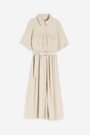
With Natalie’s discerning eye and recommendations and my inextinguishable hunter-gatherer compulsion, we’ve put together 12 distinct collections of makeup that serves to enhance your natural beauty and emphasize YOU! Below is an example of the True Autumn collection, many of which products Natalie or I own (hilariously ironic that we both ended up as True Autumns). Take a look at the rest of the collections on Natalie’s District Color ShopMy page! 

A snapshot of the True Autumn makeup collection for District Color
Getting my colors analyzed might seem frivolous or unnecessary to some, but it made a lasting impact on me! While I was confident I was an Autumn, seeing how the too-grey or too-dark colors of the sister seasons affected me with each drape made it all the more poignant how important color and aesthetics are in our day-to-day lives. Armed with a TCI True Autumn color fan, going shopping feels so much easier now! I can look at items in true white or pitch black and know they won’t serve me well; I can [more] easily sift through items that would have previously left me debating why I didn’t feel my best in them; I feel like the blinders of trending style have been taken off and I’m able to more clearly (although not perfectly… yet!) see my style as uniquely my own.
While the impact of having a color analysis session on one’s personal style might be more or less for others, I cannot recommend it enough. Seeing Natalie at District Color Studio (and giving her a follow on both her personal and professional page) should be a must-do on your next trip to Washington, DC!
*Content linked on the ShopMy platform pays out a commission to Natalie, and I receive a small commission as well at no extra cost to you. Thanks for your support!*